
Seeing is Believing
User habits in hair oil category can be influenced and changed by removing "tacky" sensorial experience and offering emotive cues in packaging.
Here, we aimed at changing the perception of hair oil and create an aspiring
Modern Hair Oil, check it out how!

We started with an open brief of stepping into Indian Hair Oil market with an advanced concept of hair oil to solve the above barriers.
Here design took the lead and poured possibilities on paper. It started with complicated flow charts put together multiple times to trace and track the thought process. Semiotic lens was applied to look at the specific context of hair and habits associated with it. Habits and behaviour are progressive phenomenon that has evolved with time and exposure to new opportunities and innovations. Nuances of consumer behaviour and hair oiling practices were decoded to layer out their core sensory experiences. Sensory perception and reaction to an elevated design experience are key touch points of this case study.
Reaserch
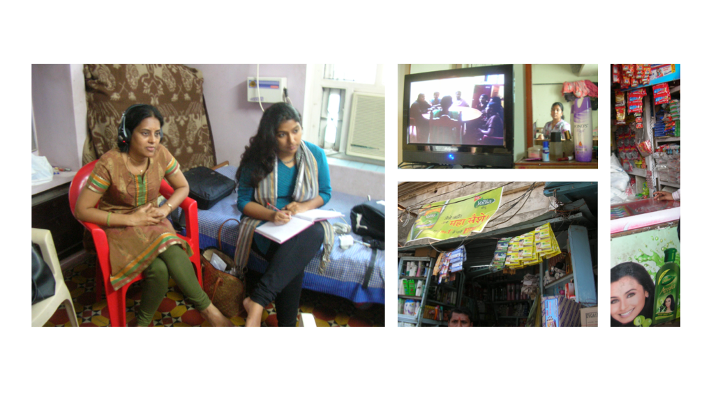
The formative research for this project was led by two broad spectrums based on LSM cut to dive deep into consumer behaviour. We discovered there are 2 kinds of believers:
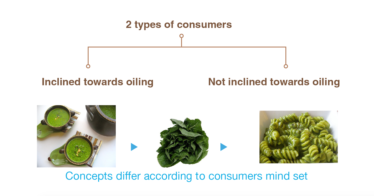
Indians are truly hair oil believers however some have migrated to other formats due to the negatives in hair oil. People who have moved towards other formats like hair cream, gels, conditioners, leave in conditioners etc feel guilty of not oiling their hair. This mindsets are our target audience for this project.
Analogy: They are the ones who know spinach is healthy but they are not able to consume it in traditional formats. Hence adding spinach in the food they prefer is a way out.
Hair care regime has region specific peculiarities. This was discovered in the qualitative consumer research conducted with different set of respondents living in diverse geographies. People in southern part of India add herbs to their hair oil to enhance its goodness.
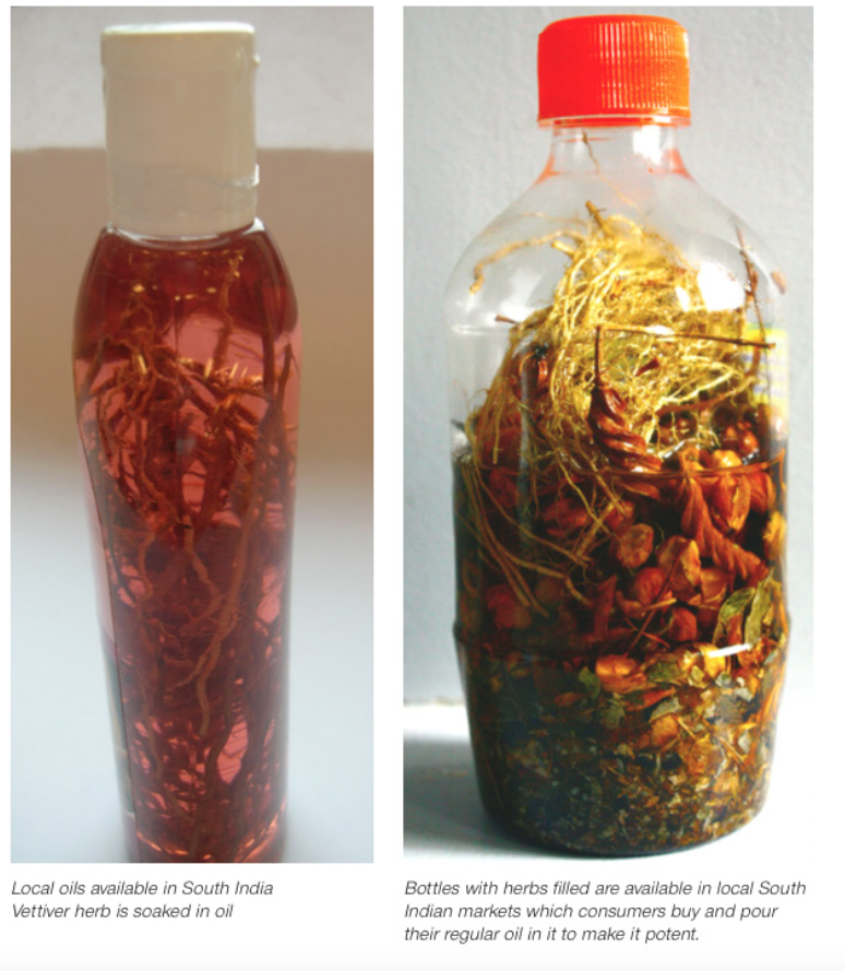
This insight triggered the concept of “Seeing is Believing”. Point of proof adds value to vague imagination. In this ace paced world of FMCG, consumers are looking for a “believable” promise from brand offerings.
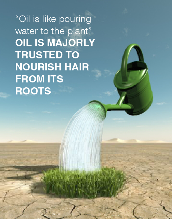
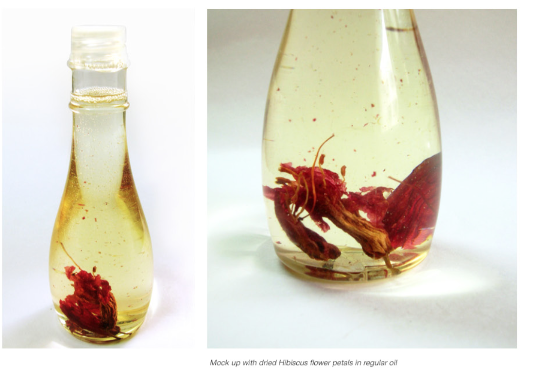
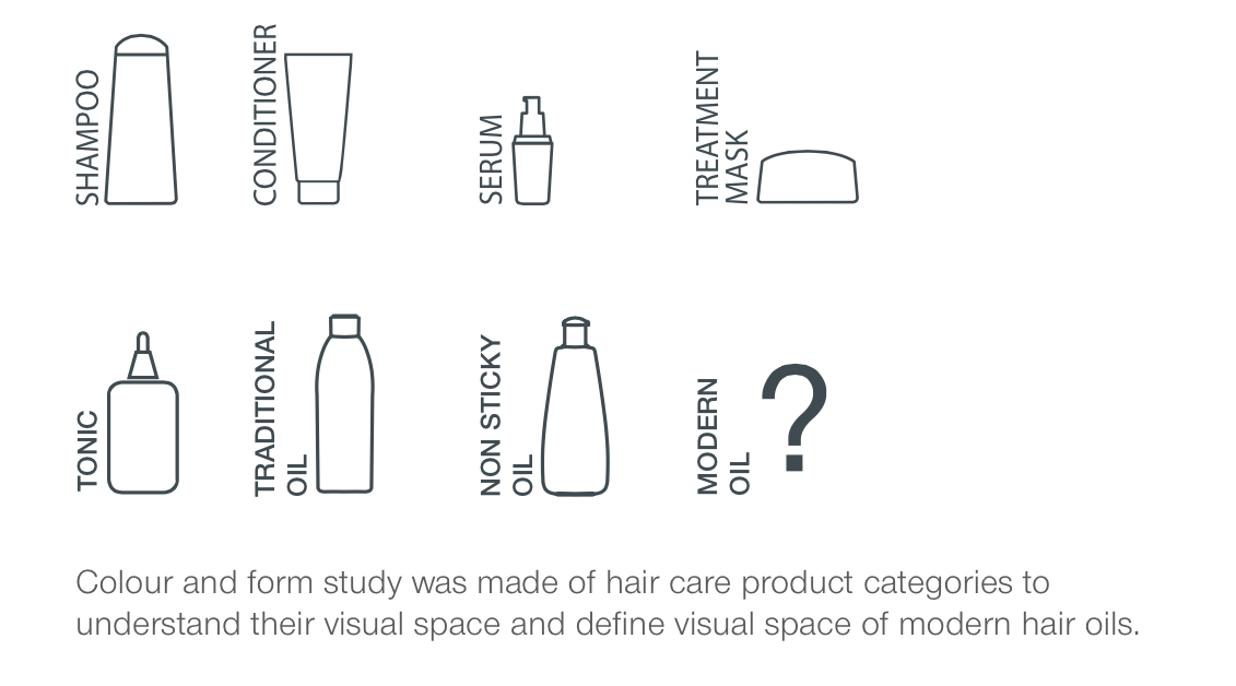
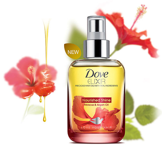
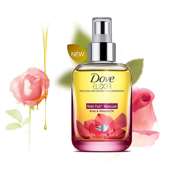
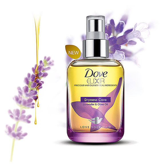
Design research paved way to define the direction for this project. Insights from the research influenced the formulation of the hair oil. With the help of Nano technology, hair oil formulation was made lighter in viscosity to eliminate negative sensorial from the overall experience. Sensorial engineering was the first step towards bringing in the element of innovation in the regular hair care regime. Inspired from the practices discovered from southern India and recommendation from the formative design research, formulation team infused flower petals in the potent hair oil. It served as emotive trigger and indicated visual cue to fixate user’s belief. It also played up the nourishment quotient and reinforced the idea of oil being “food for hair”.
Birth of sub-brand
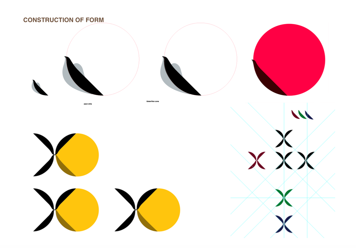
This project grew up as an integrated narrative, which travelled through different segment of a typical product development. Open brief hypothesis was brought to the users. Research insights induced the formulation and inspired the nomenclature for this product. Dictionary defines Elixir as “magical or medicinal potion”. Users always come to a brand with aspiration and expectation for magic. Here it is, best-suited name for this potent hair oil infused with flower petals. Visual identity for the product was crafted with precision and alignment with the core concept for formulation. The word mark has cues of flower petals well thought out in the typographic form of character “x” in elixir. Now this magical formula was seeking an appropriate container to reside in. This juncture was very crucial to state the manifestation of this innovative formula.


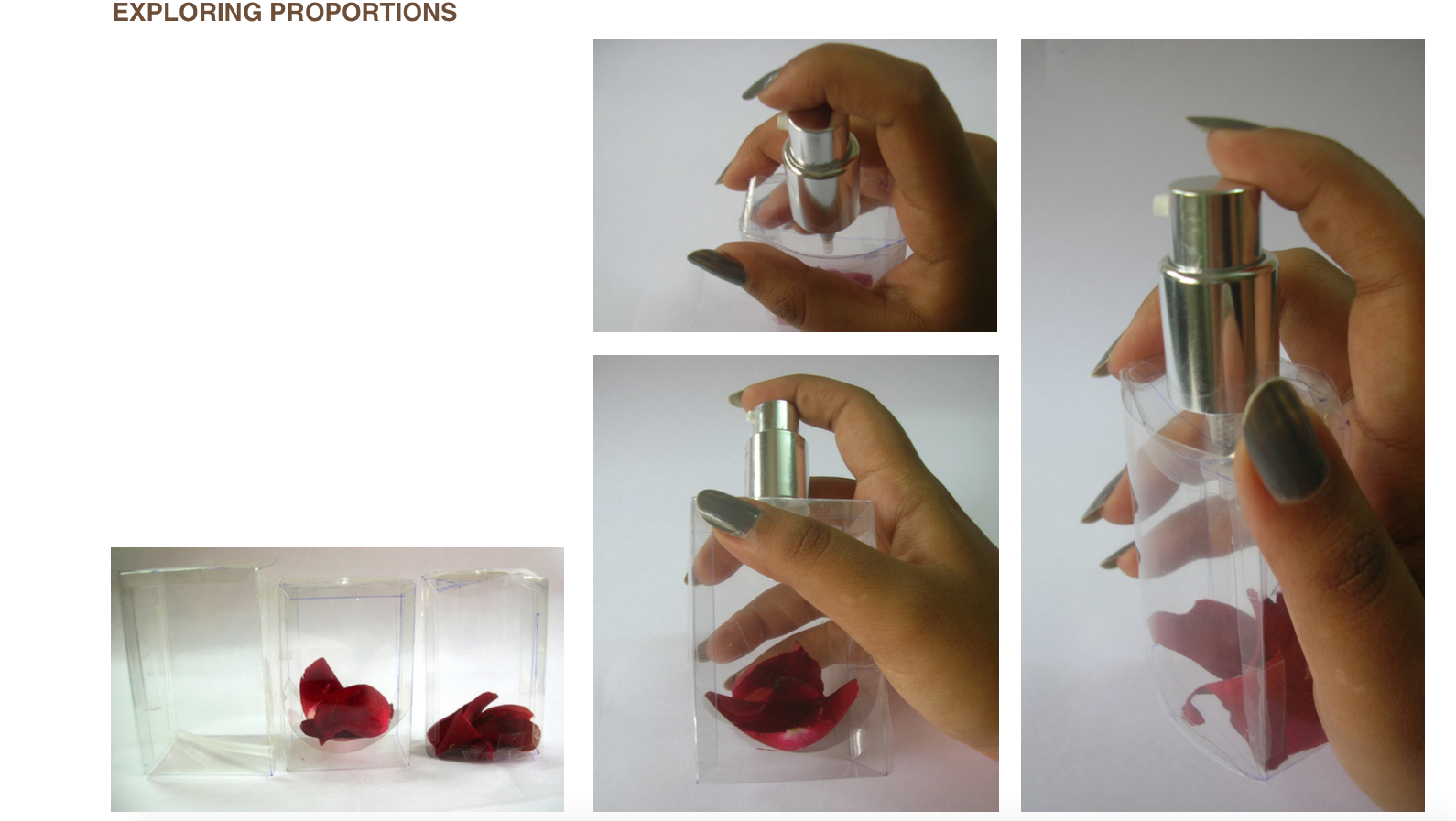
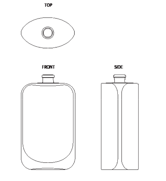
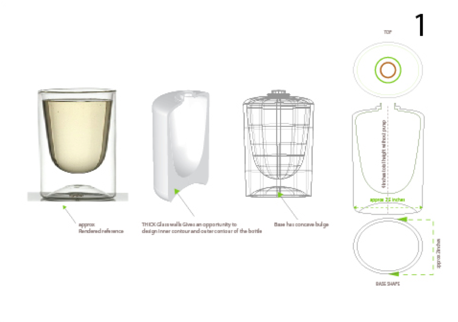
Form must compliment the formulation. 3D and 2D packaging design for the dove oil evolved around this precise consideration. Secondary research was conducted to trace the relevance of packaging in elevating product experience. Inspiration was derived from the perfume segment where the glass bottle with pump enhances the visual, tactile and olfactory sensorial for the user. Attar bottle served as truly inspiring and desiring format for the research. Geometric and stable form of a tinted glass bottle with a slightly push up base gave desired form to dove elixir. This solved the challenge for 3D packaging.
The oil bottle was give a premium look which propagates efficacy.
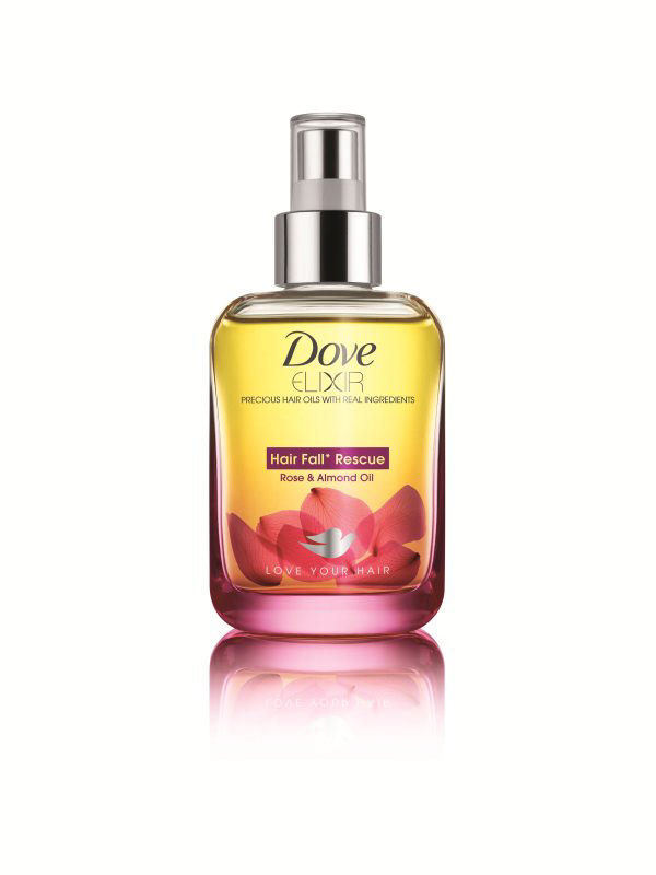
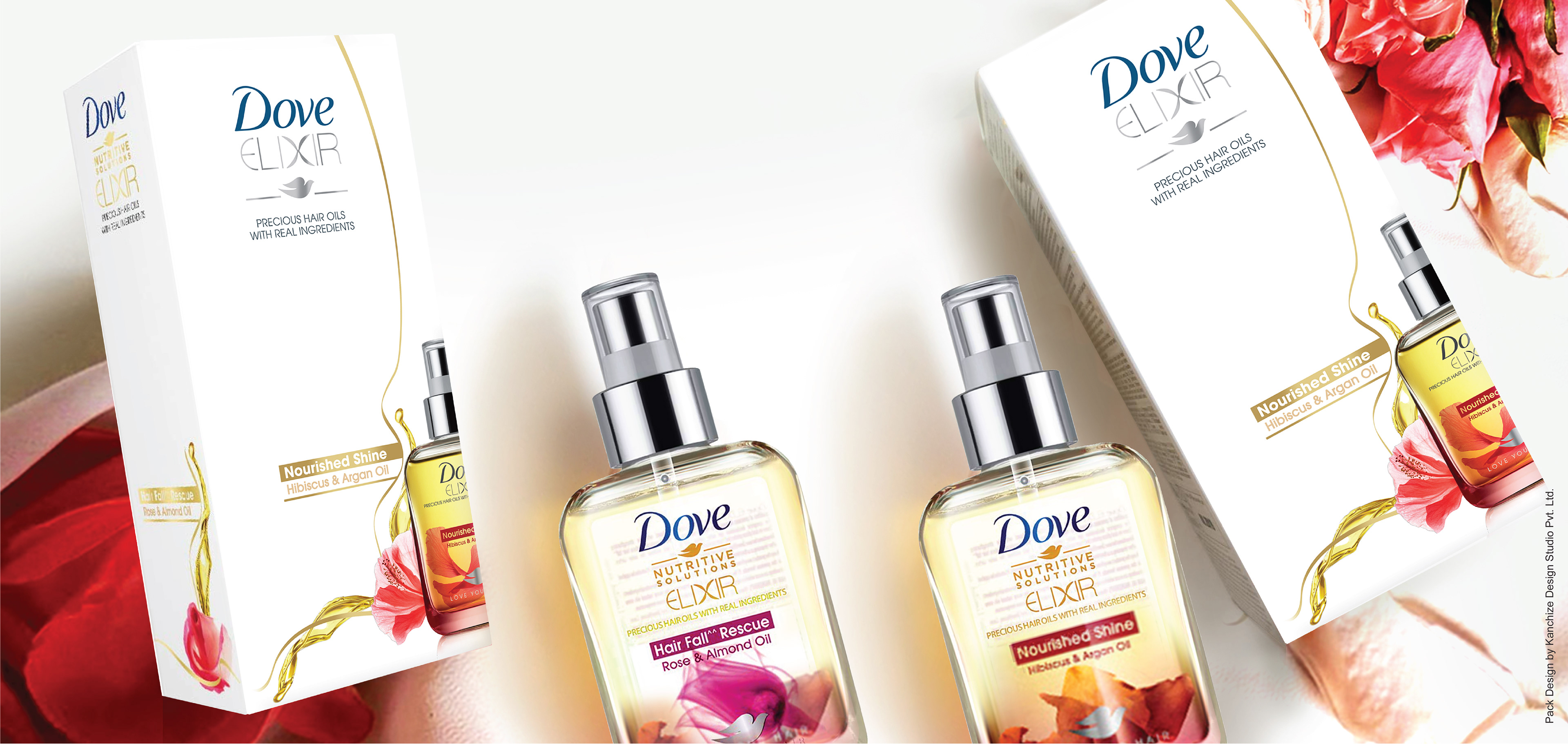
Dove Elixir: Hair fall Rescue
To add and glorify the petal infused oil in an appealing bottle, it was very crucial to have appropriate branding on it. Transparency was the key attribute acquired from “Seeing is Believing” concept. Hence screen-printing on the bottle was chosen as an apt route to retain transparency and have minimalistic design elements to align with Dove DNA.
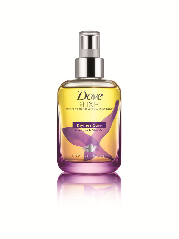
Dove Elixir: Dryness Care
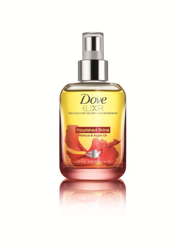
Dove Elixir: Nourished Shine
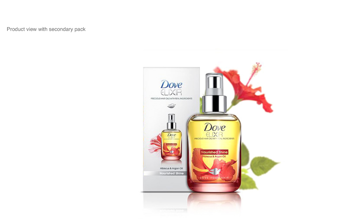
With this secondary packaging in form a white carton with crisp branding on it completed the over all product experience, precisely the dove way.
Carton added functional traits of stacking and brand blocking on the retail aisle.
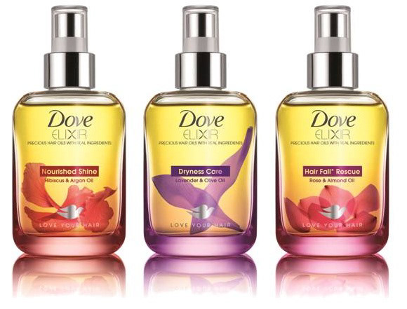
Dove Elixir Hair Oil Range
In this project, design and visualisation was needed at every stage. Working on this project was a big learning. Open-ended brief served as an exploratory canvas for the designer, which was validated at each stage with formulation and brand team. Here design marched out beyond the visual and structural space to dive deep into consumer perception, behaviour interpretation and product formulation. Open brief was shaped up adhering to technical constraints and innovative design ideas. This project was loaded with insights on oil habits and user perceptions. As Dove Elixir Hair Oil Packaging Design is a solution for LSM 12+ proxy users, our next case study captures the offerings for the migrated hair oil users. Do take a glance at it !!