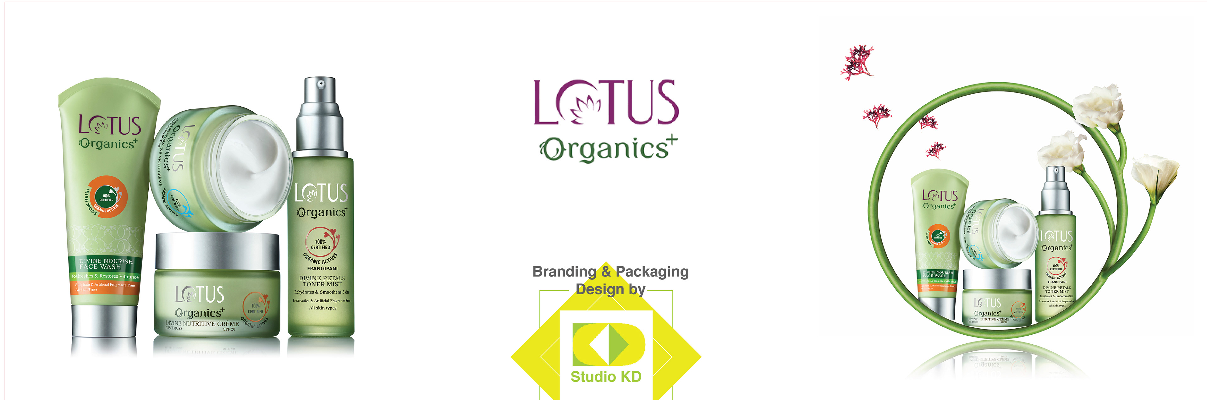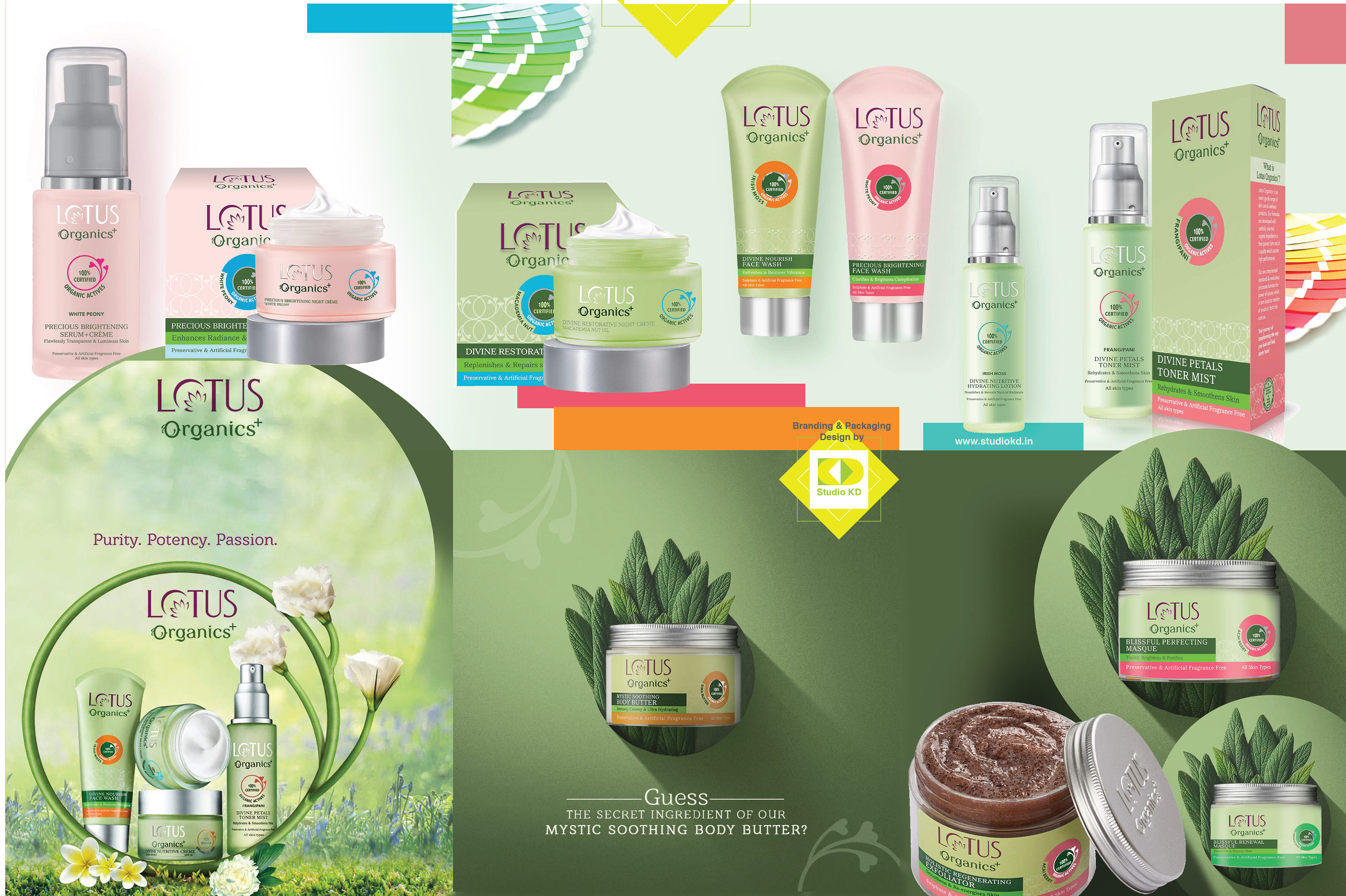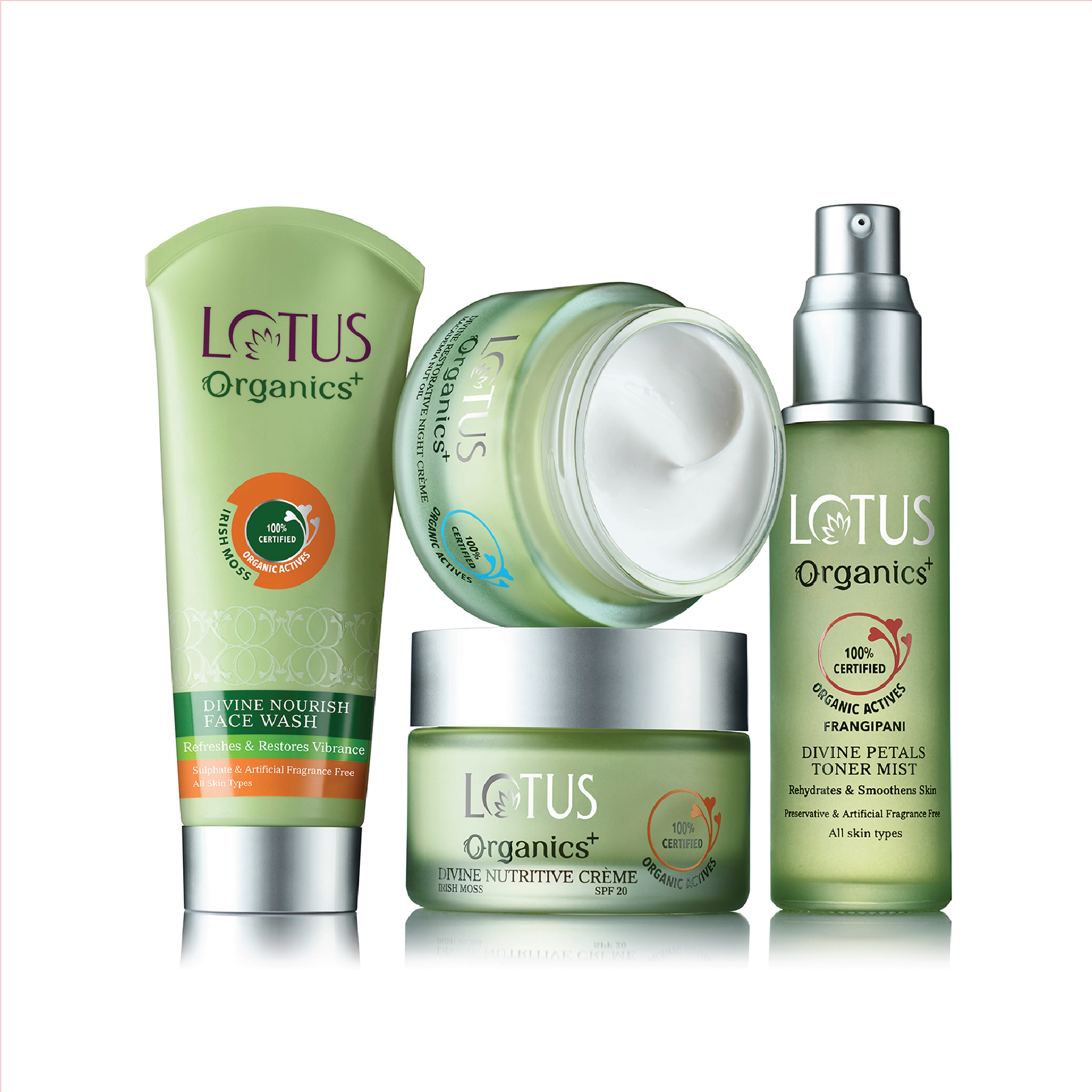
Branding and packaging design for Lotus Organics+
A range of personal care products thats truly chemicals and cruelty free.
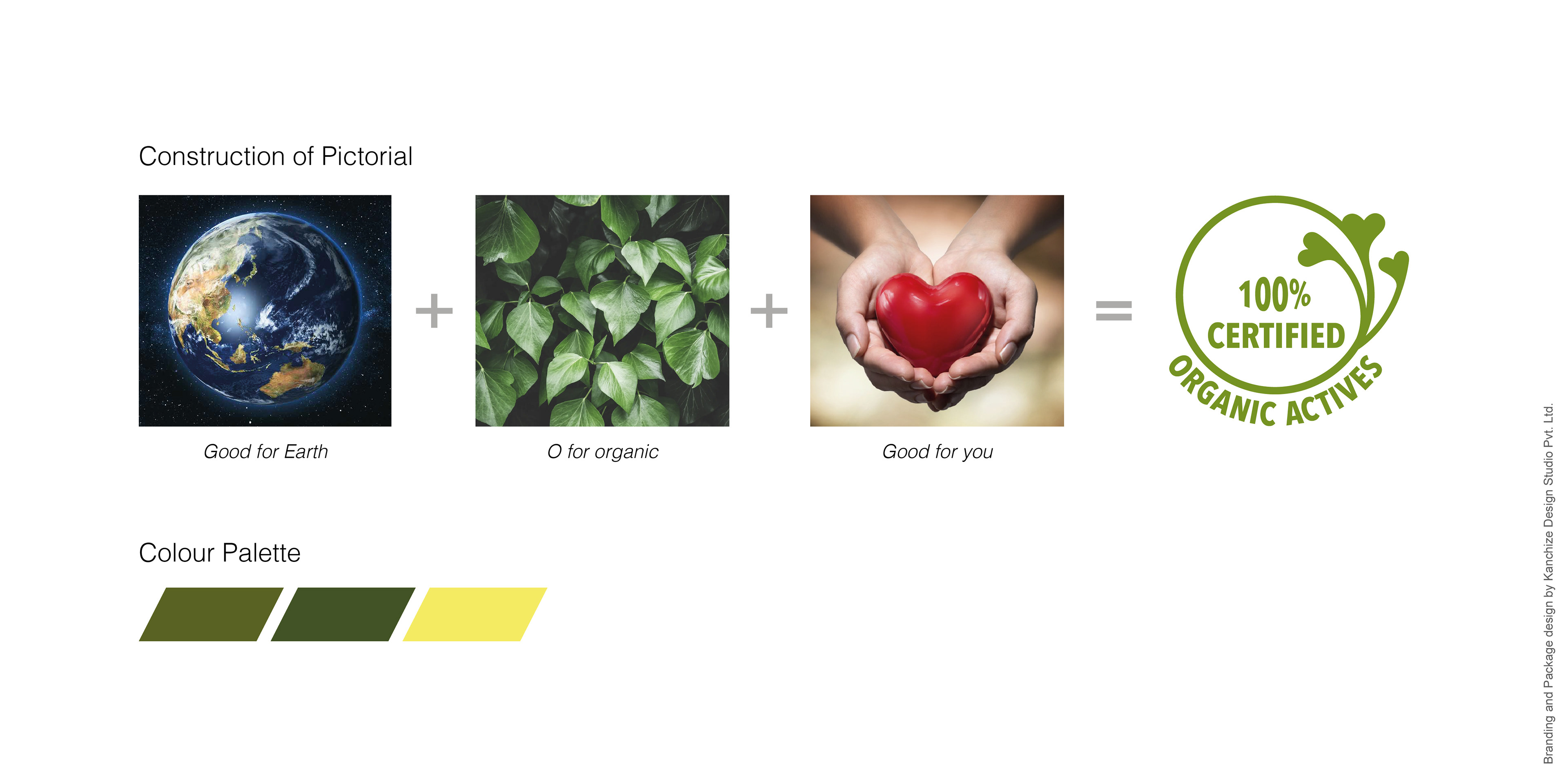
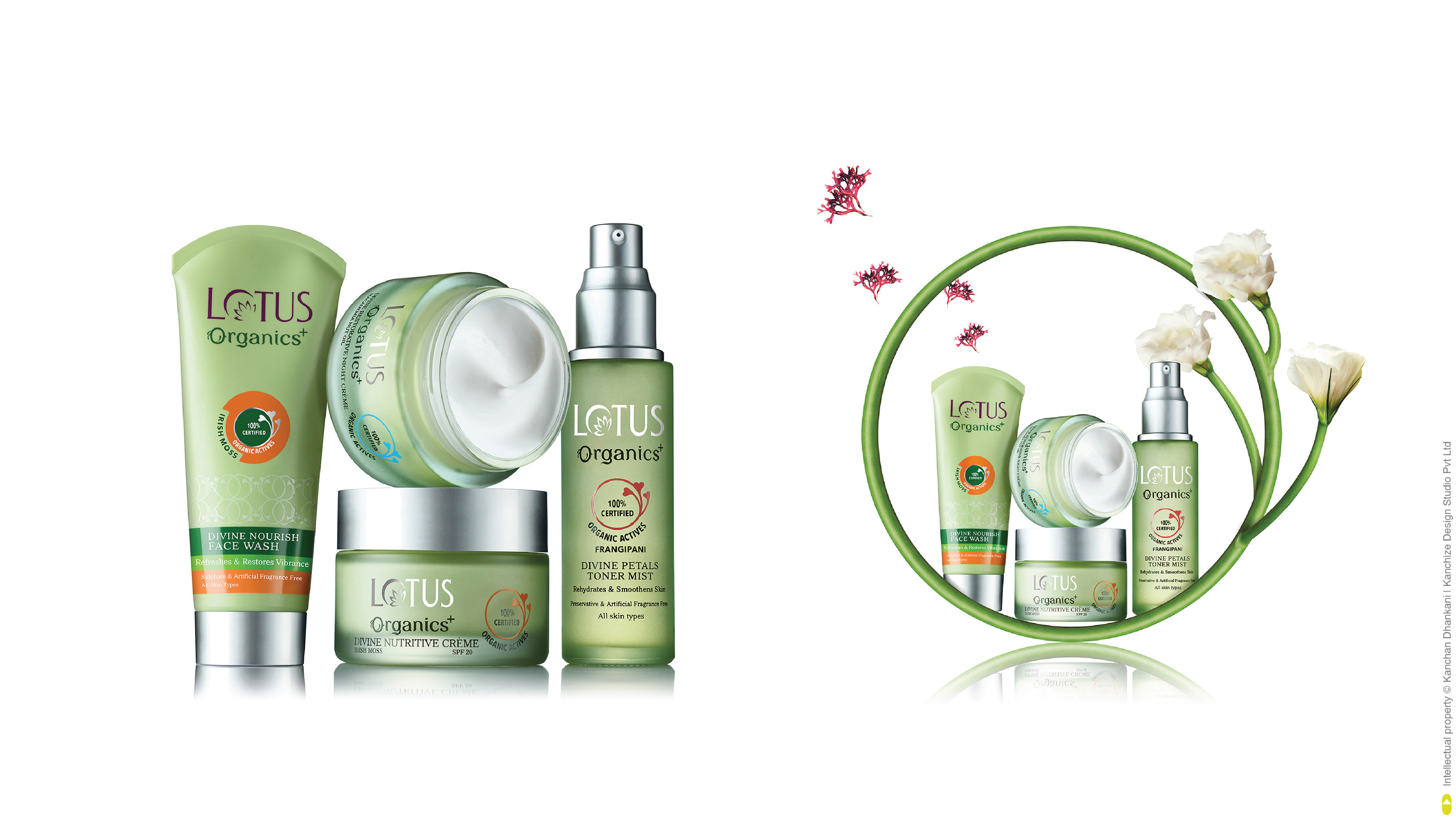
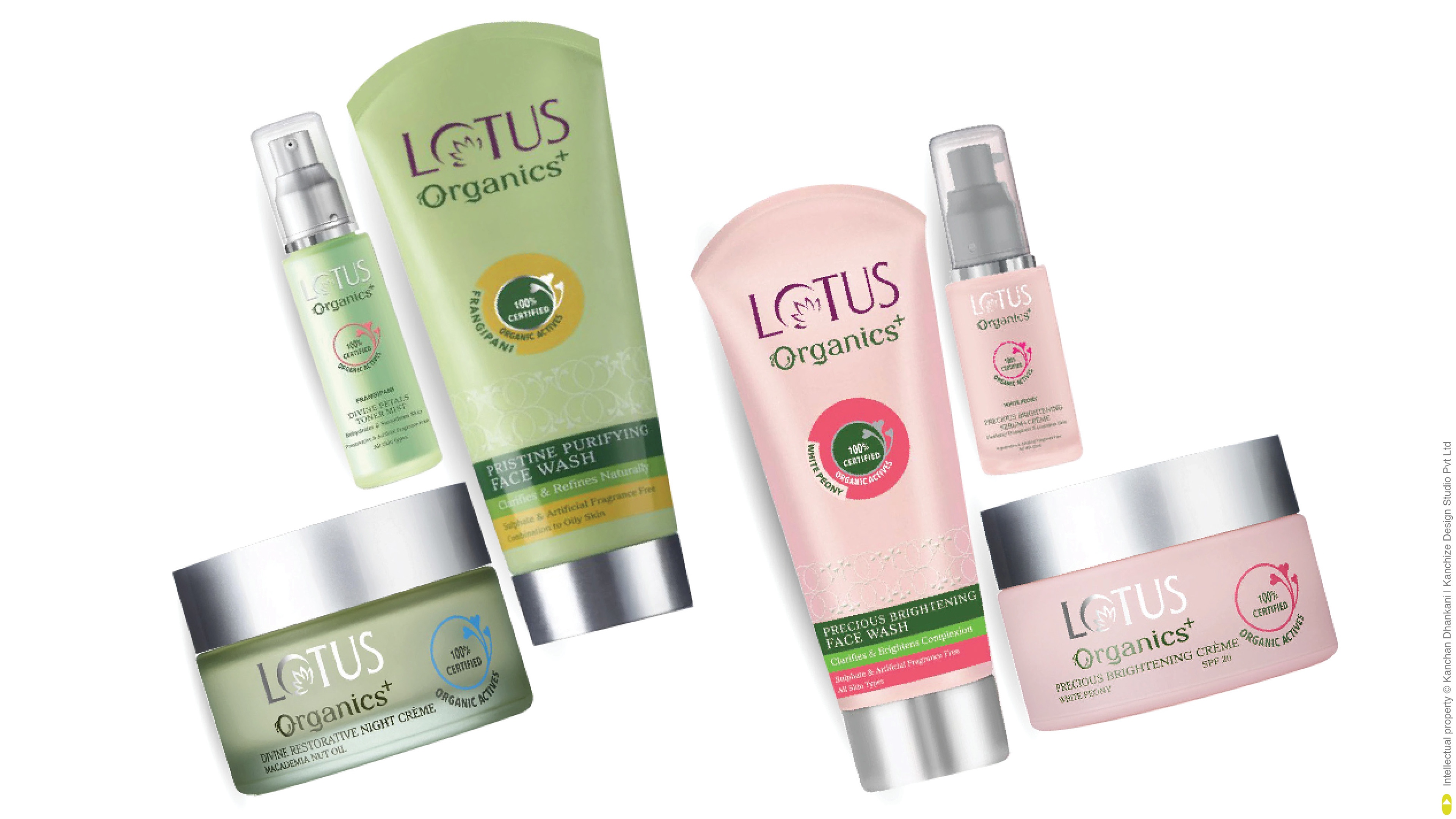
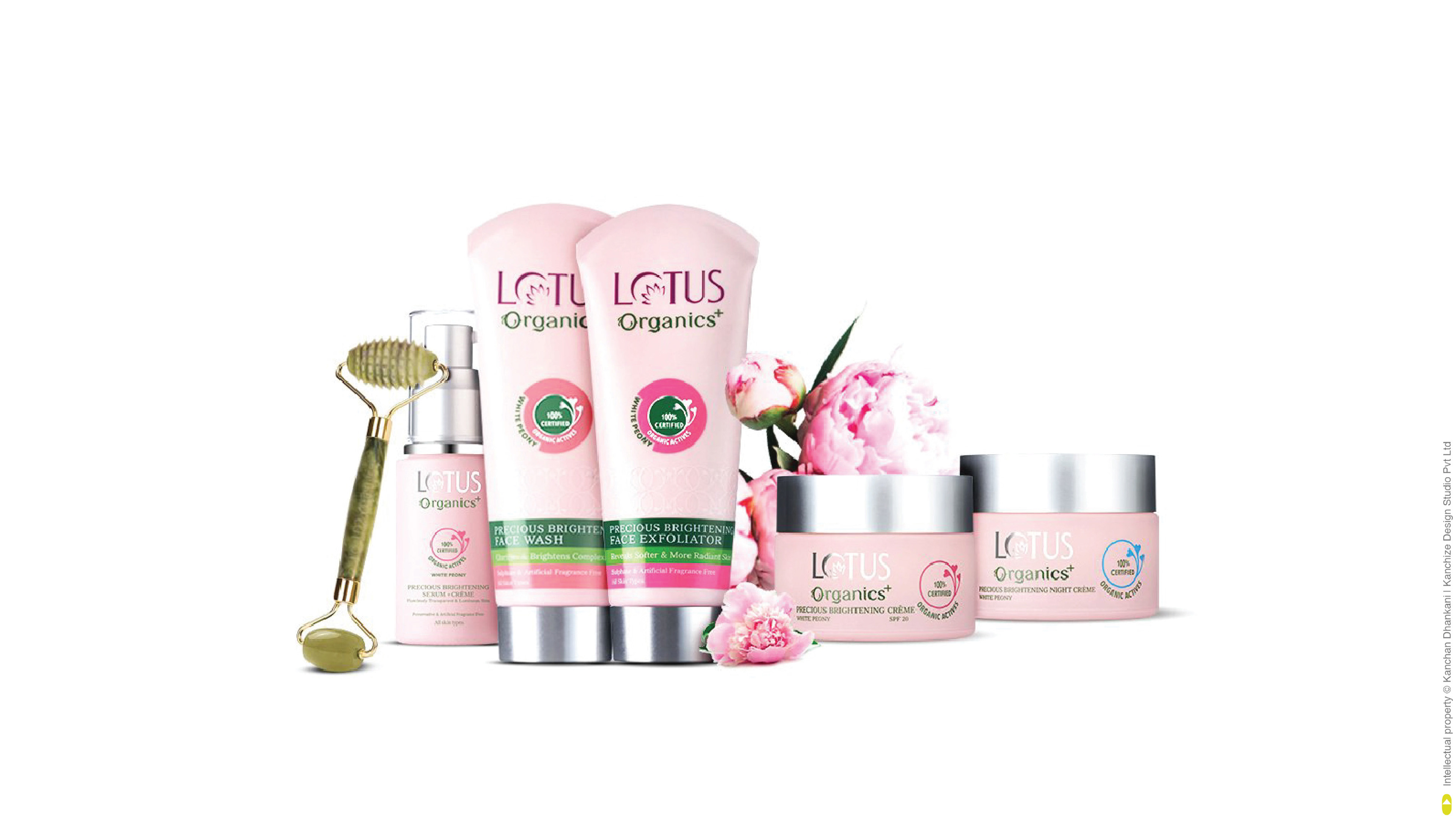
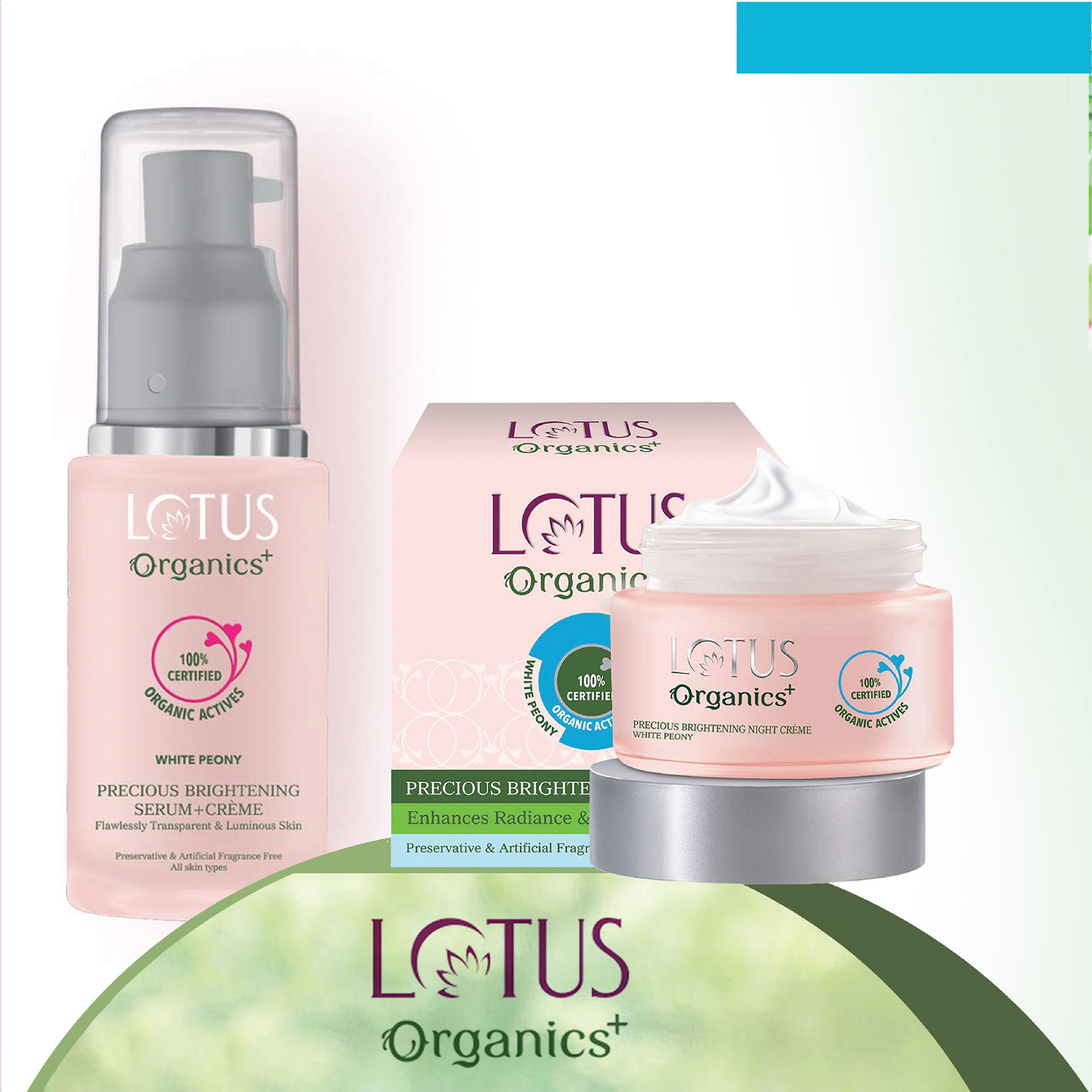
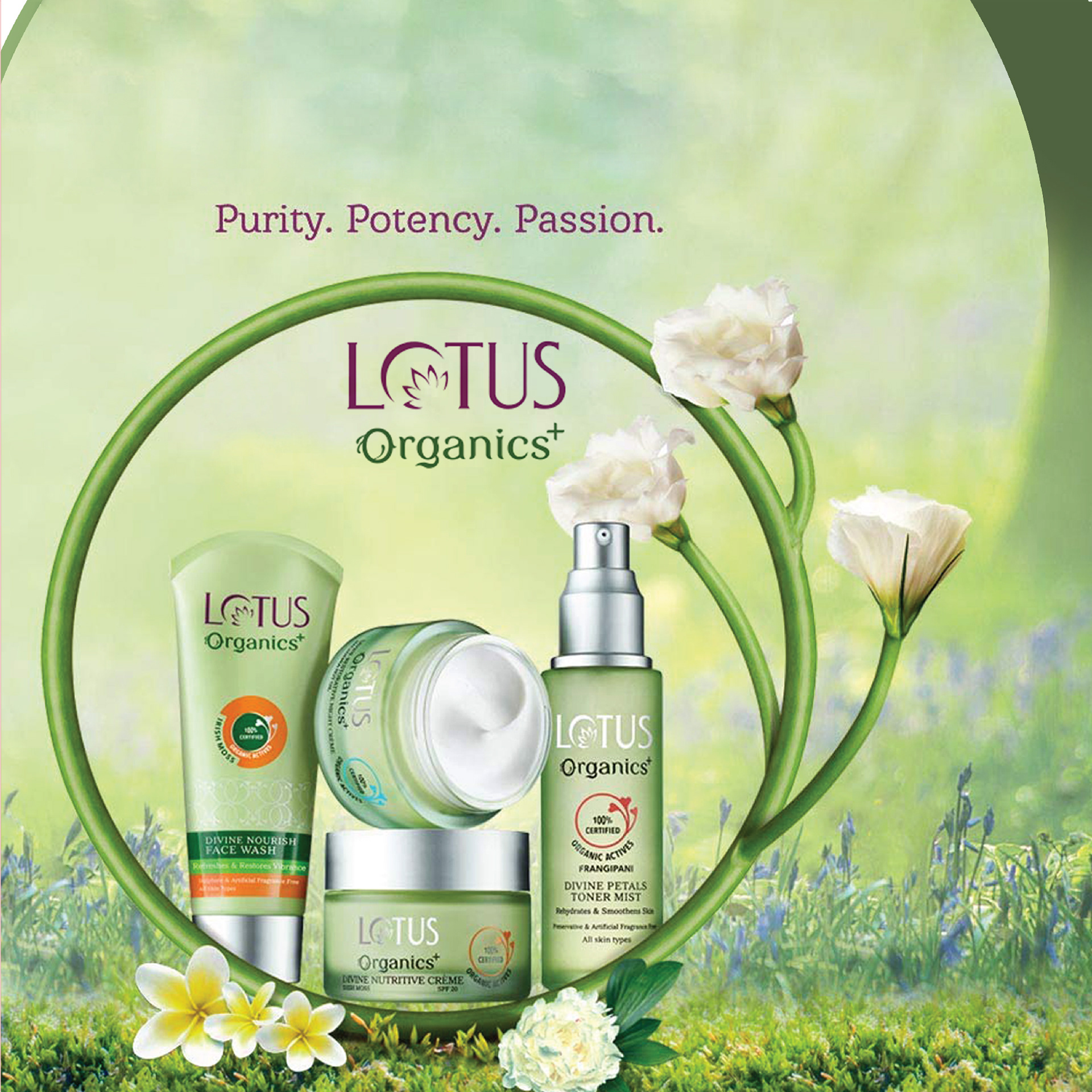
We built a signature design language that fits seamlessly on all packs and all materials... the design language also continues on communication... the symbol builds unique organics semiotics and is able to hold brand recall value.
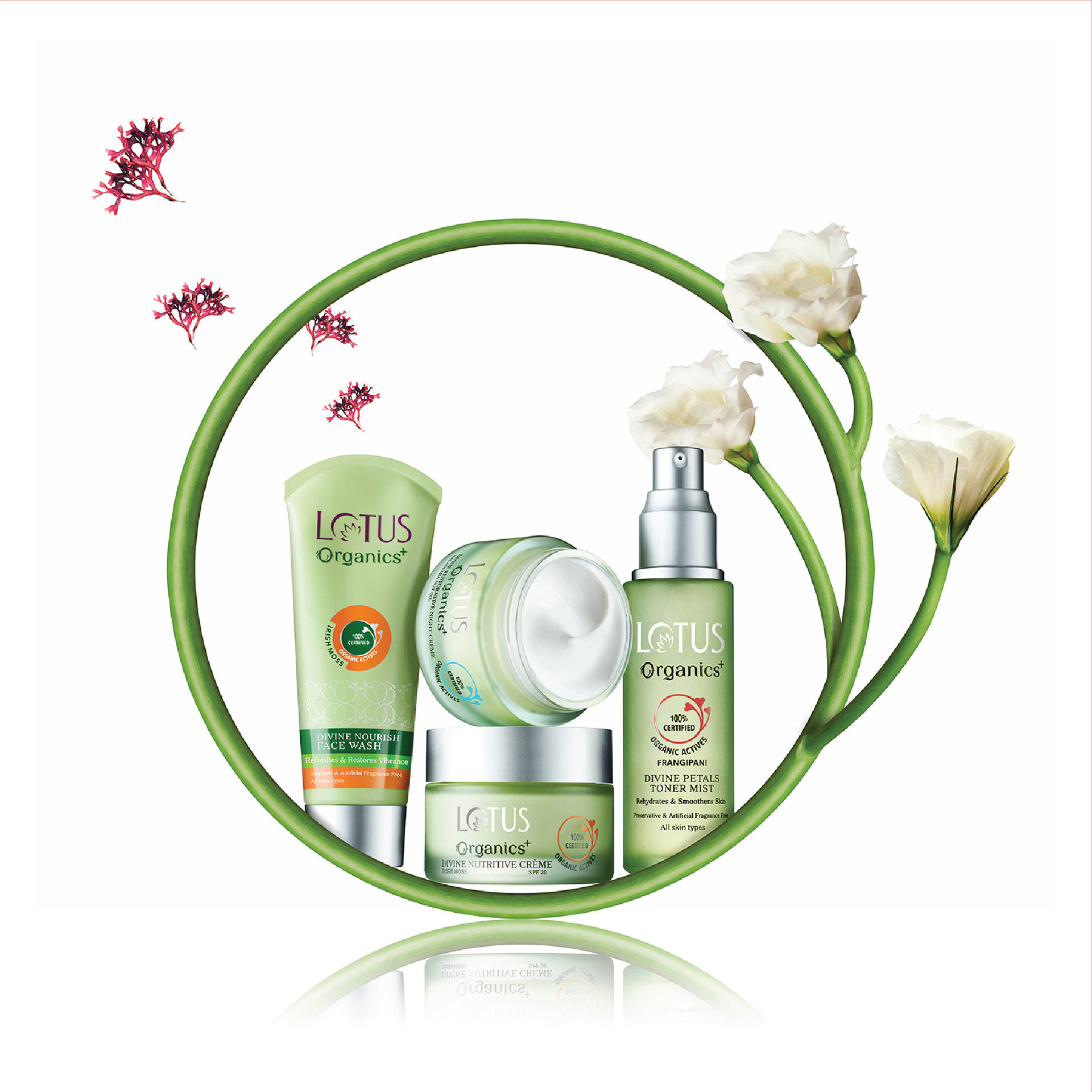
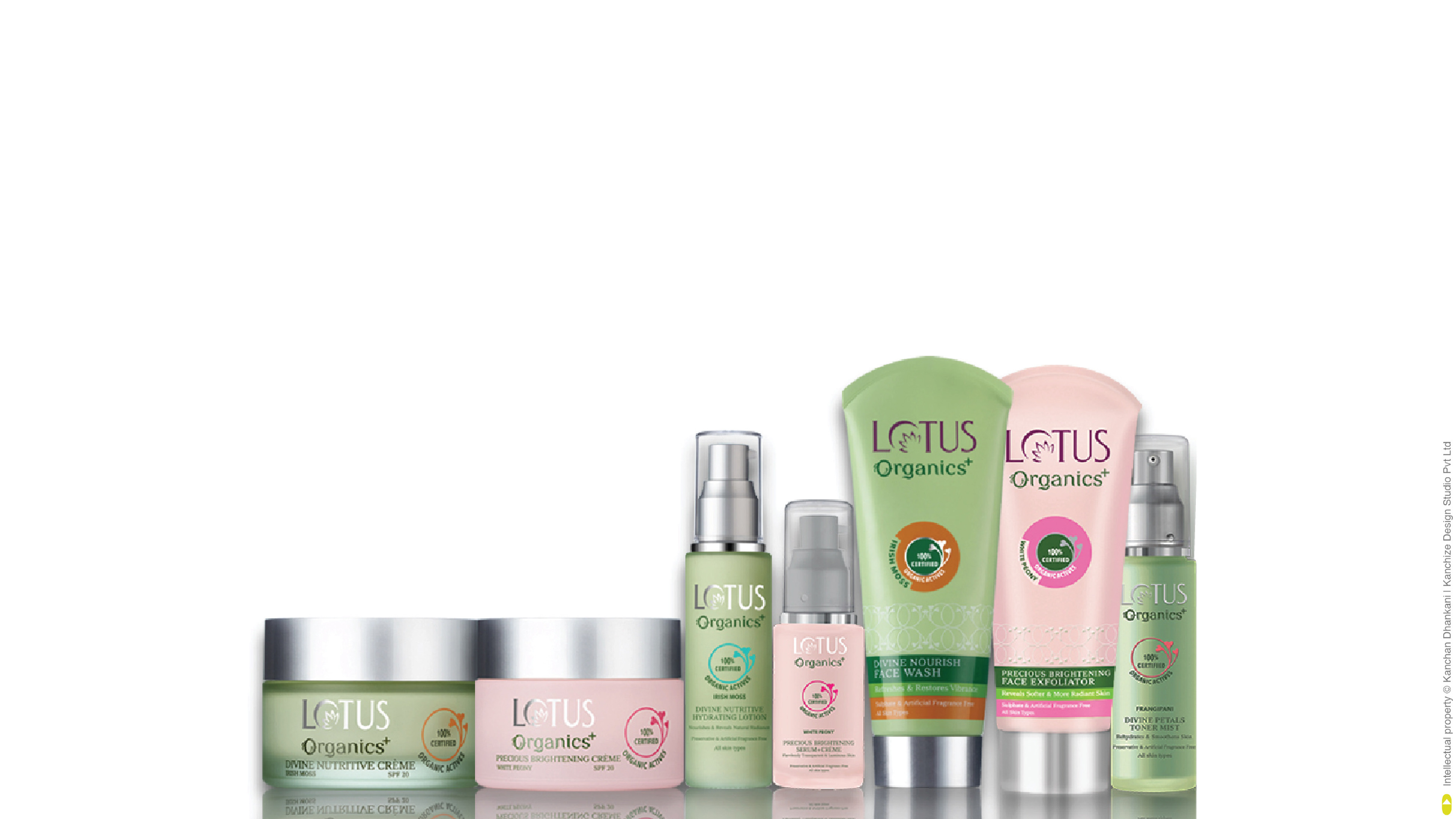
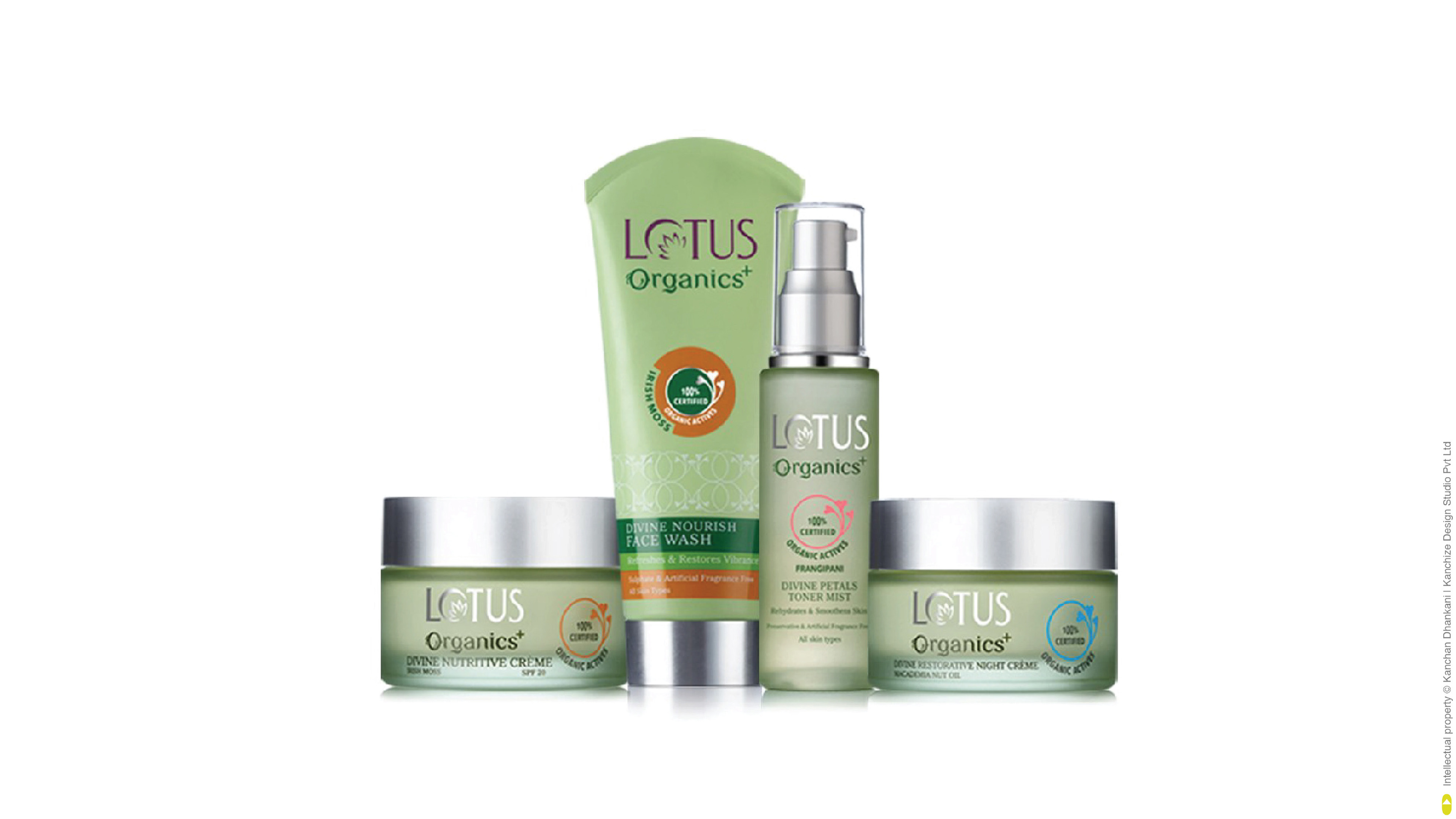
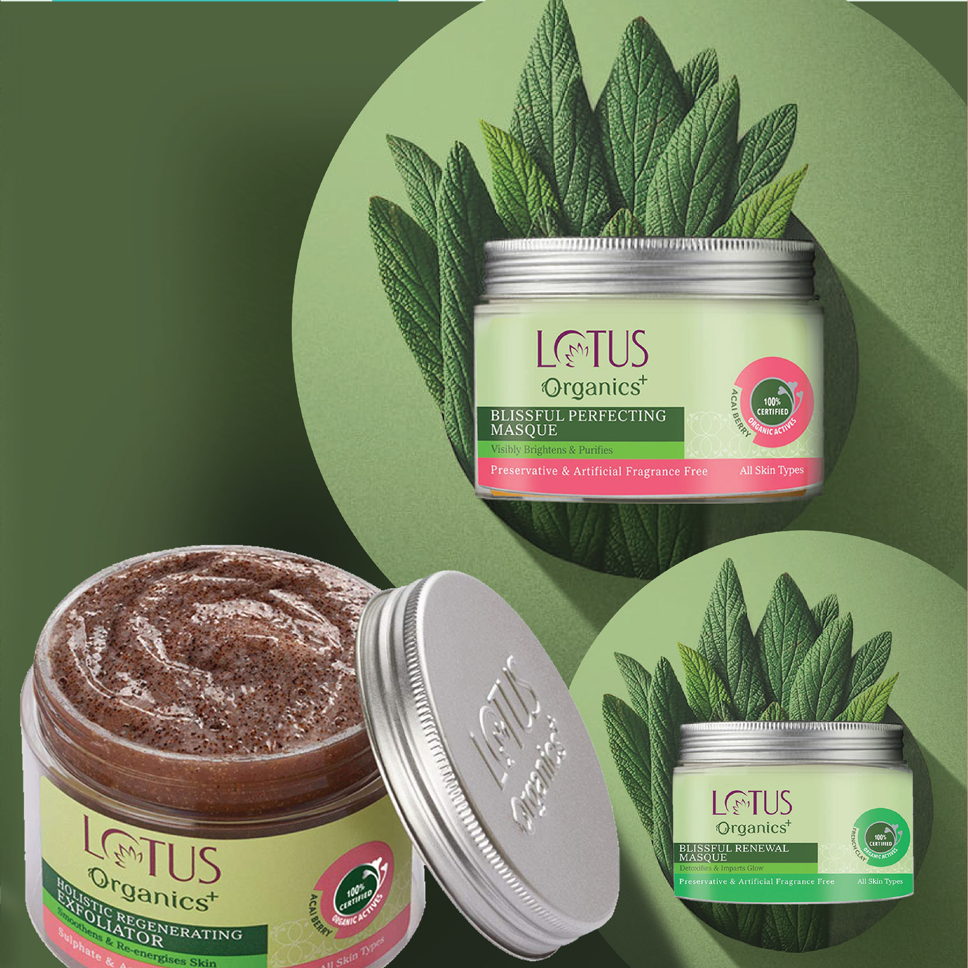
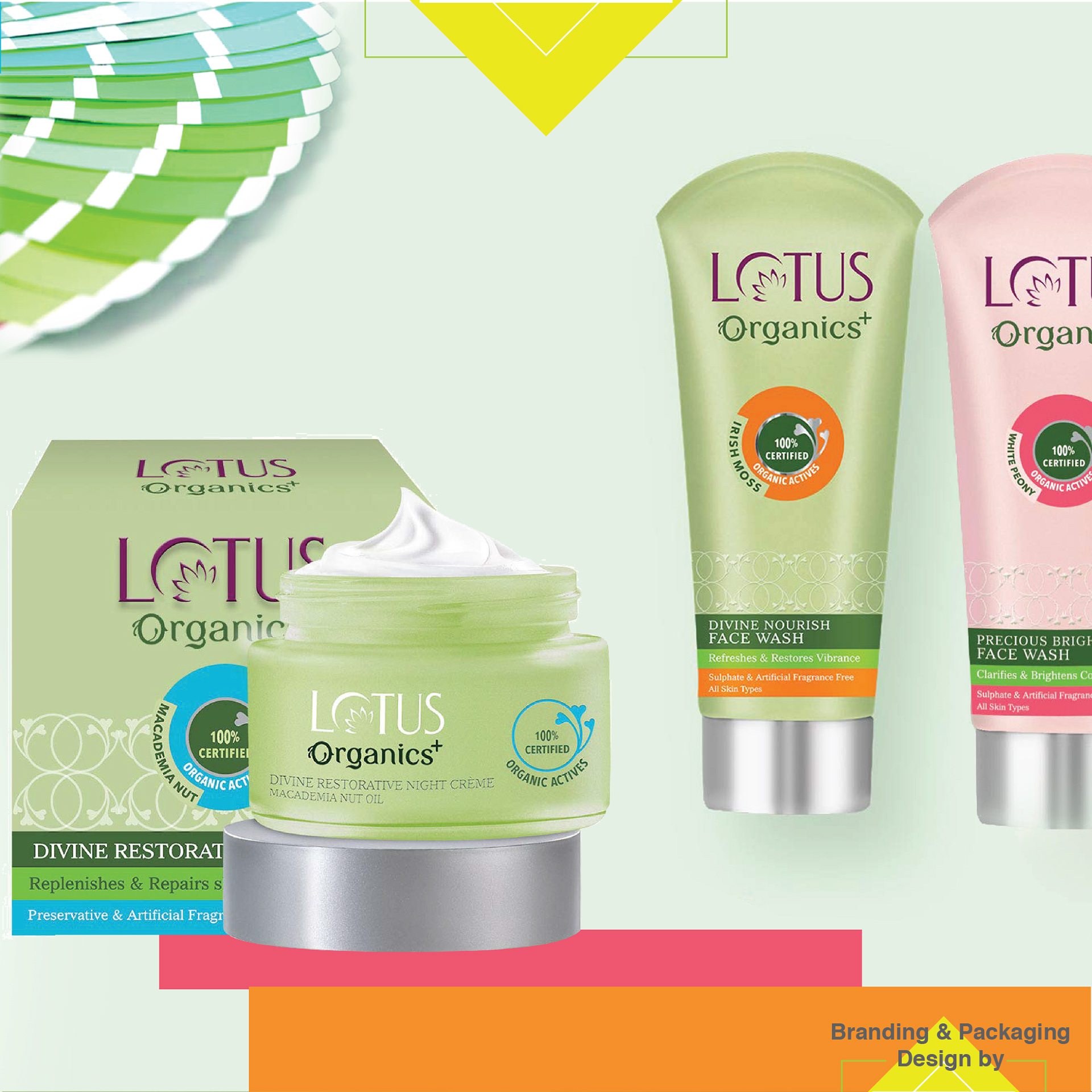
Young colours for variants and and signature pastel green brand colours are used as in clever proportions to create colour blocking without making the range look monotonous.
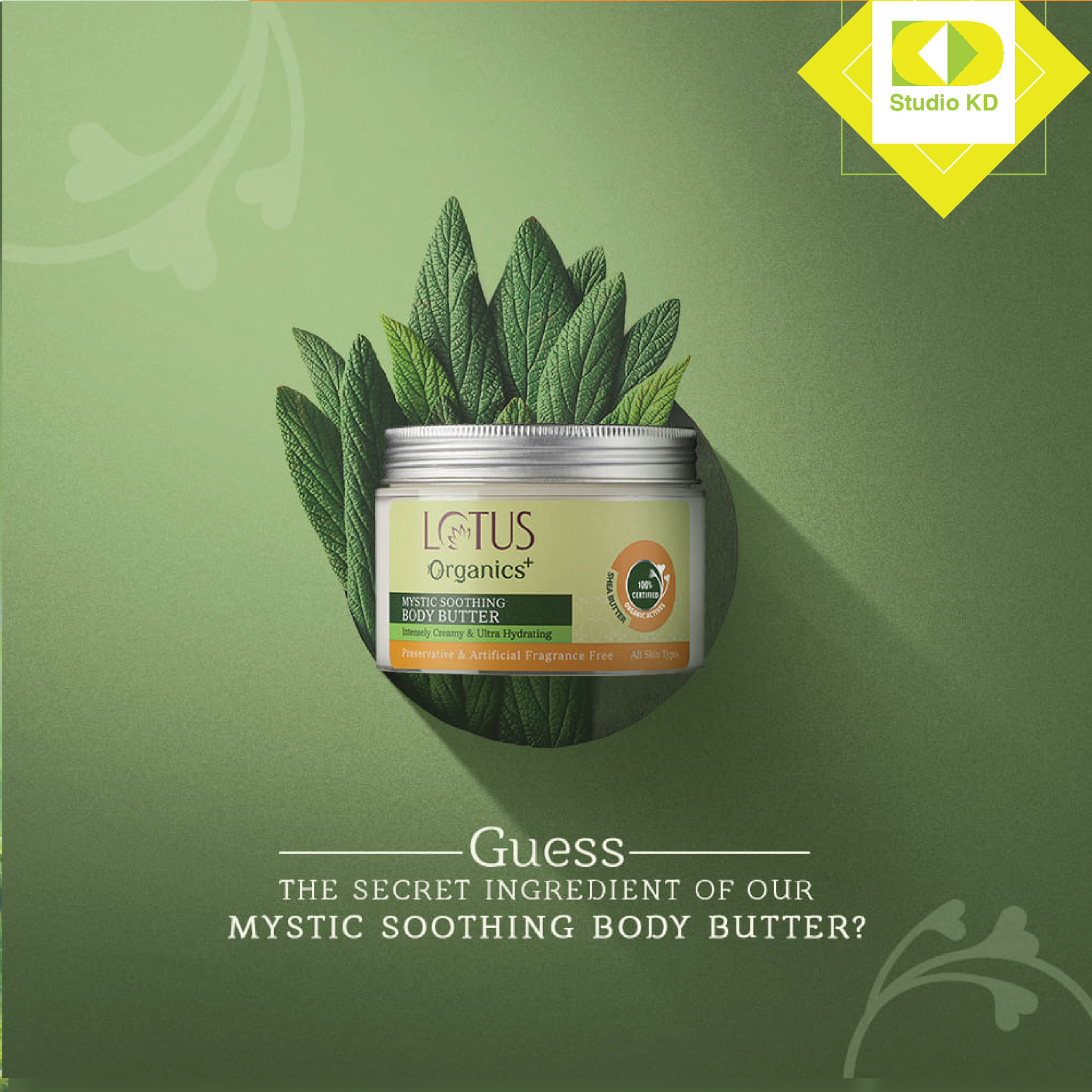
Traditional Glass Container with metal caps are used to relate it to olden days packaging method. It helps the brand stay connected to the roots and yet have pop colours and maintain vibrancy of modern world. The pastel green brand colour represents nourishing gentle care and calming nature of natural ingredients. The subtle green brand colour also helps the variant colours to shout out/pop out and create strong differentiating identity for variants and formats.