
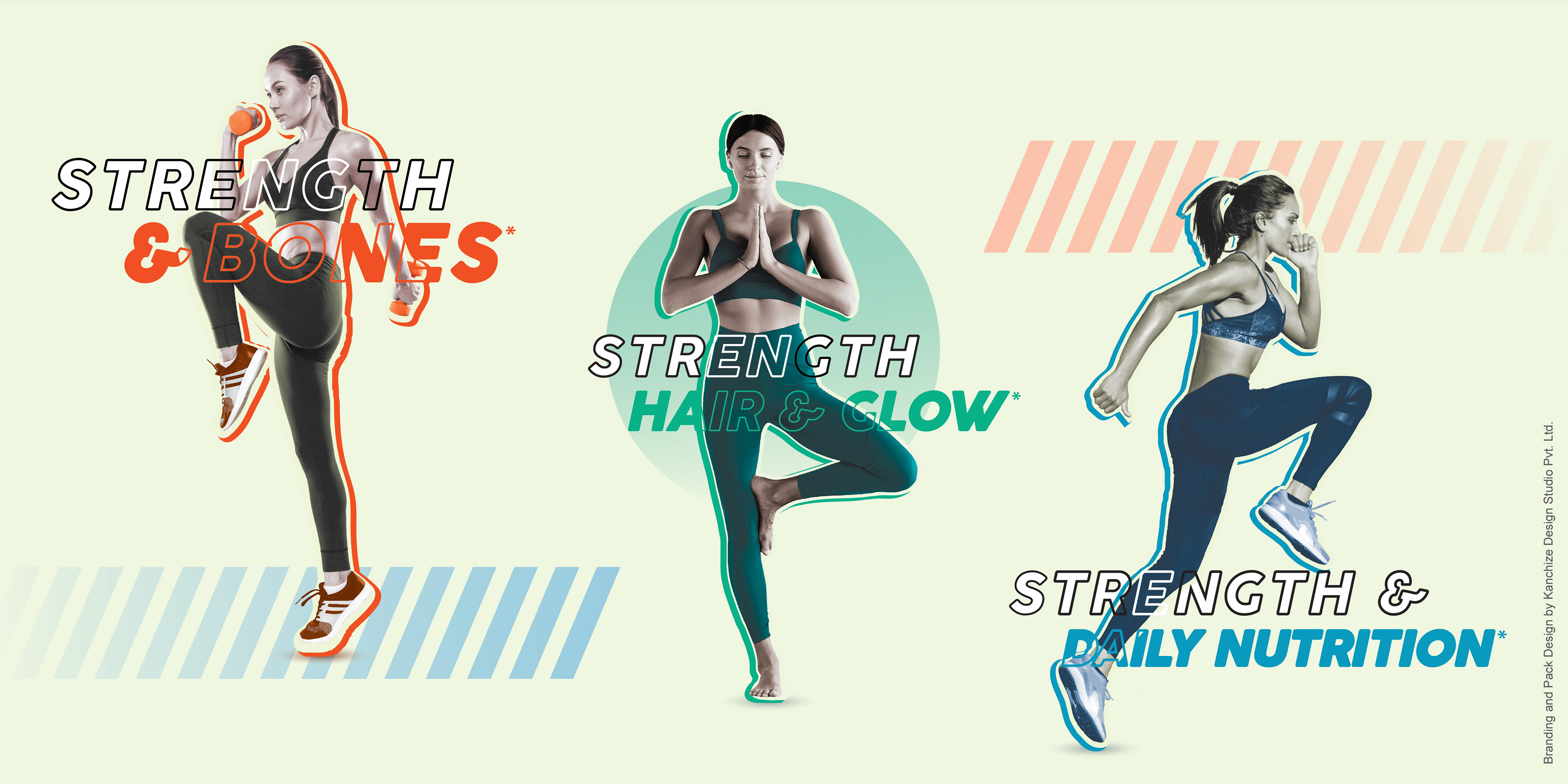
Forget stereotypes! Rethink what women power looks like in sports. Design that celebrates all types of women in action breaks the mold. It shows strength, dedication, and the joy of pushing boundaries.
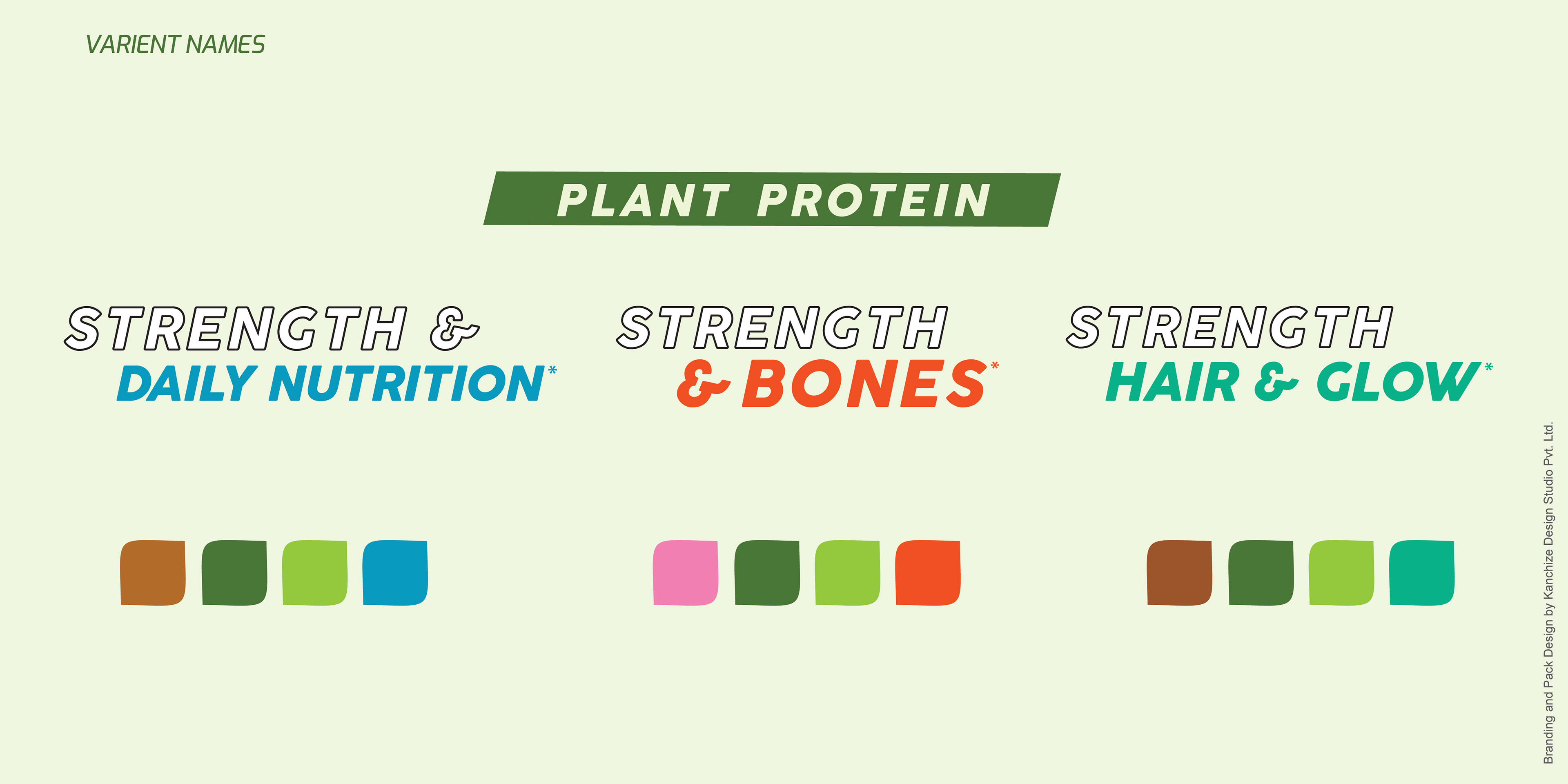
Our TATA GoFit Plant Protein project is a bold step – showcasing women confidently owning their workout space on the pack, This is a message of empowerment that inspires.
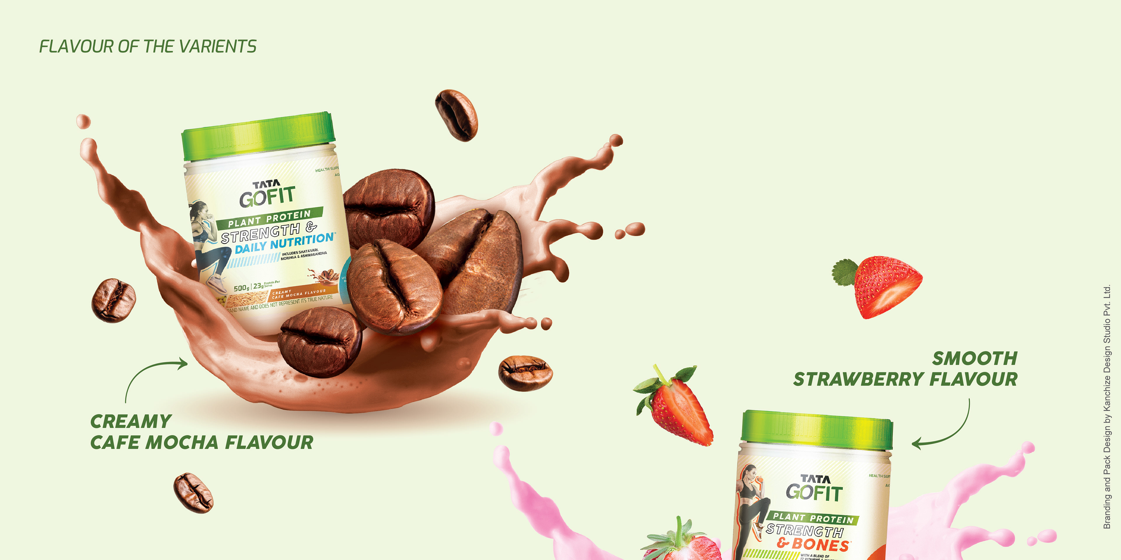
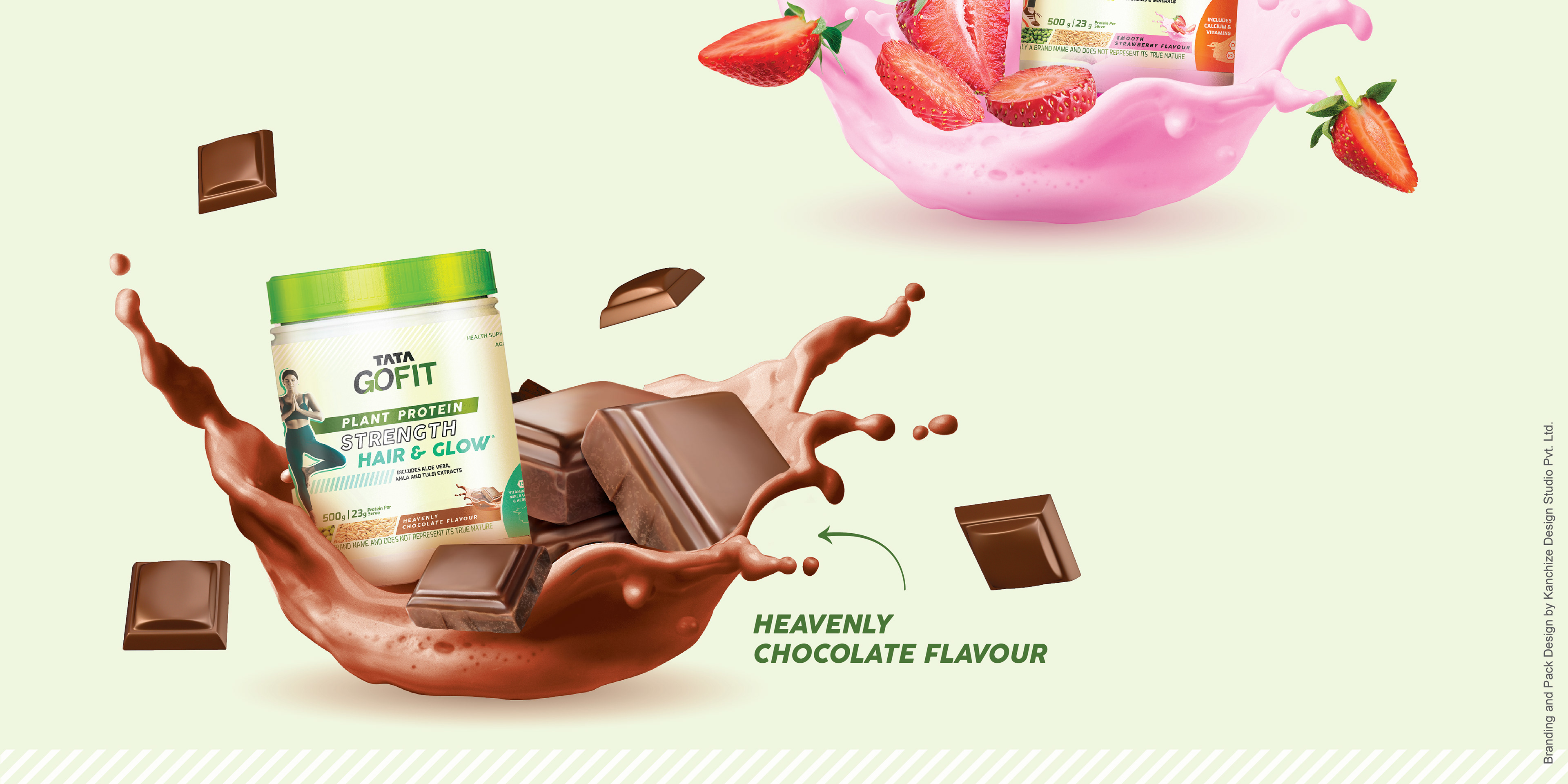
This protein pack isn't just strong, it's a celebration of you.
We designed a nurturing space, bursting with natural safe feel, energy and strength, all crafted specifically for women. The pop-art inspired design uses a vibrant collage language, creating a world that reflects the dynamic energy of our brand and the women who fuel it.

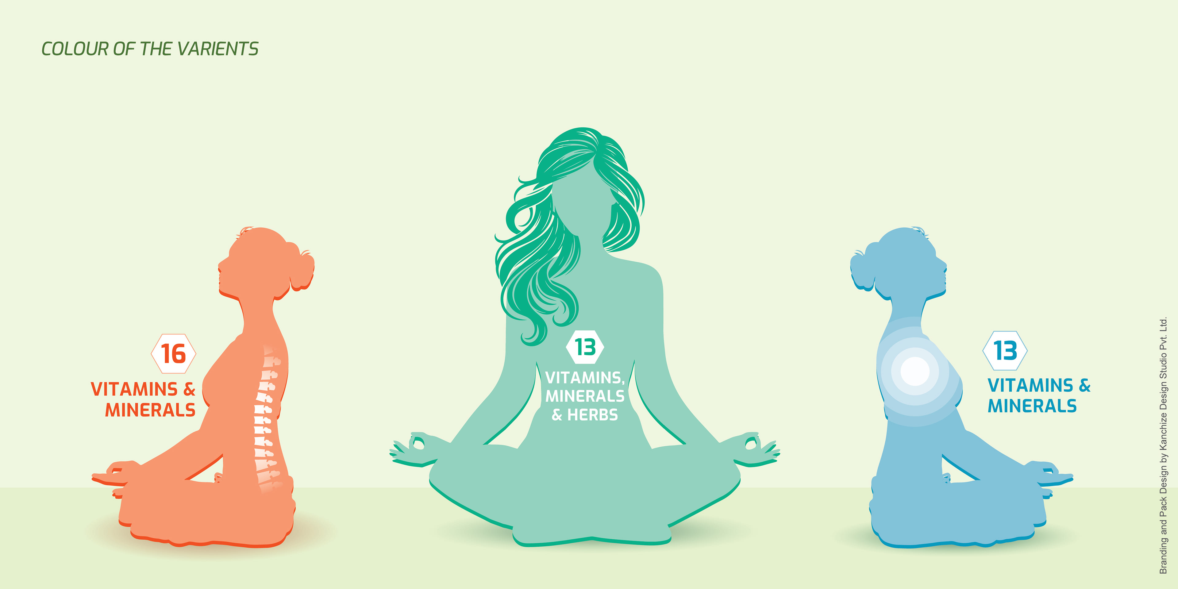


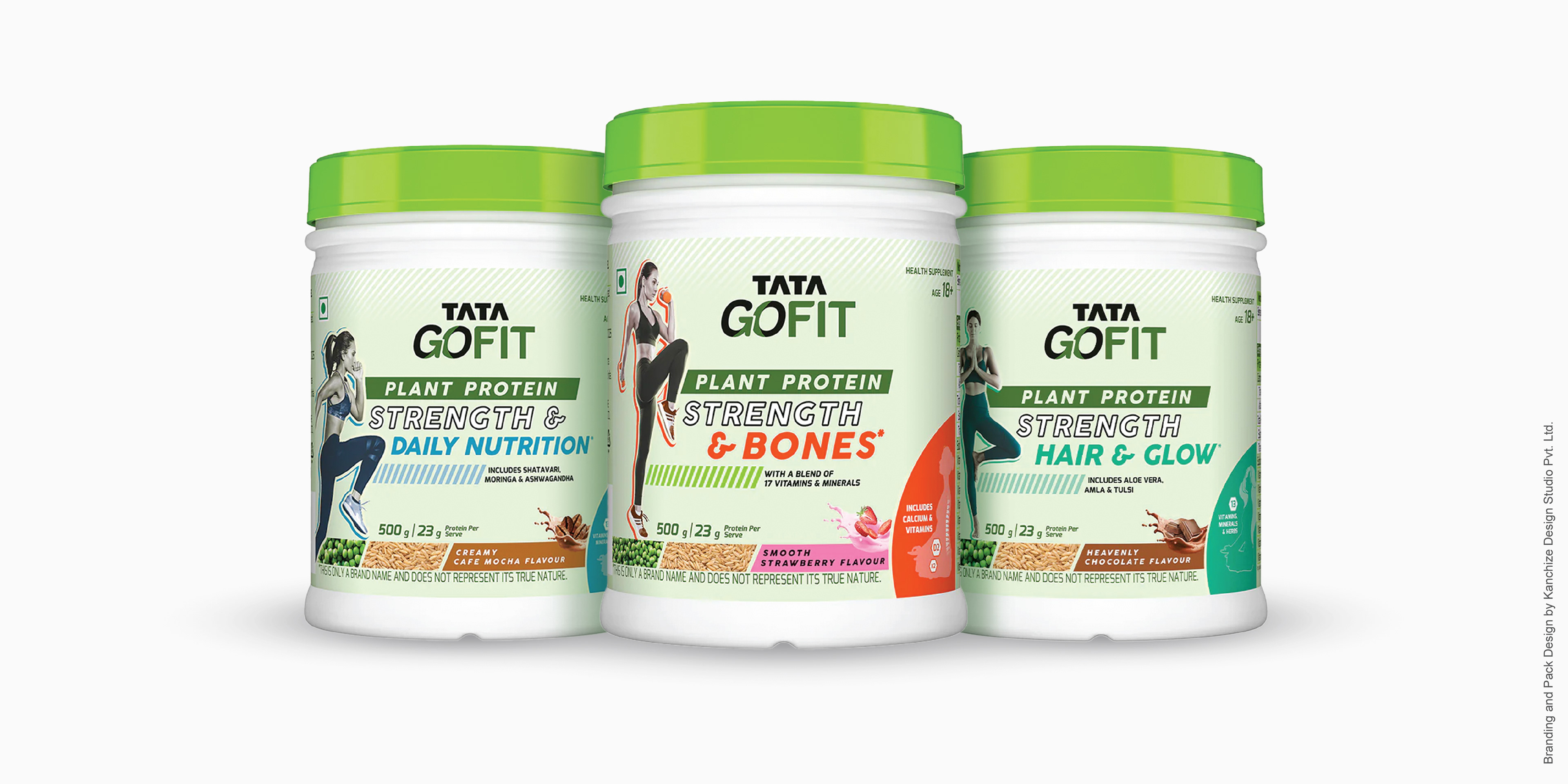
We have balance of Information and Visual Emotives: This means our design effectively conveys both the practical details (ingredients, benefits) and the emotional message (energy, empowerment) without one overwhelming the other.
This design has clear Information Hierarchy: The layout guides the consumer's eye through the most important information in a logical order, making it easy to understand what the product is and what it offers.
We have both these 2 key elements working together creating a strong and user-friendly design.
Hope you like it.
Do share your POV in comments.